Creating a Chart
You can use charts to illustrate the information presented. The chart makes it easier to compare and relate data to each other. The right kind of a chart quickly gives an overview of the data, but also contains enough additional information so that you get the right impression of its contents. Charts are added to presentations, for example, when reviewing the organization's financial results for a certain period of time or the results of a customer survey or, for example, for the presentation of scientific research results.
Charts are indeed one of the most common contents of PowerPoint. Next, we will practice adding and editing a chart in PowerPoint. We will add a chart to the presentation slide 3. Afterwards, the slide should look like this:
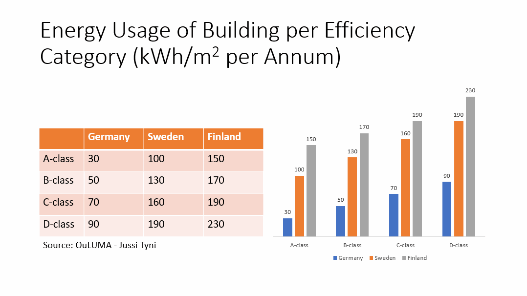
Let's start by making some room for the chart.
Task: Change the formatting of the slide 3
Move to the slide 3 (“Energy Usage of Building per Efficiency Category (kWh/m2 per Annum)”) and choose a design idea with two content placeholders. If you cannot find one, change the slide's template to Two Content.
Afterwards, format the table cleanly into the left placeholder. In the model below, we have made the following changes:
- reduced the font size of the text inside the table to 20. (If the font size isn't reduced, PowerPoint will not let you reduce the size of the table to fit the space given.)
- the height of the table's cells has been set to 1.4 cm, by navigating to the Layout tab, Cell Size group, and using Table Row Height.
- moved the table and text box to their place on the left
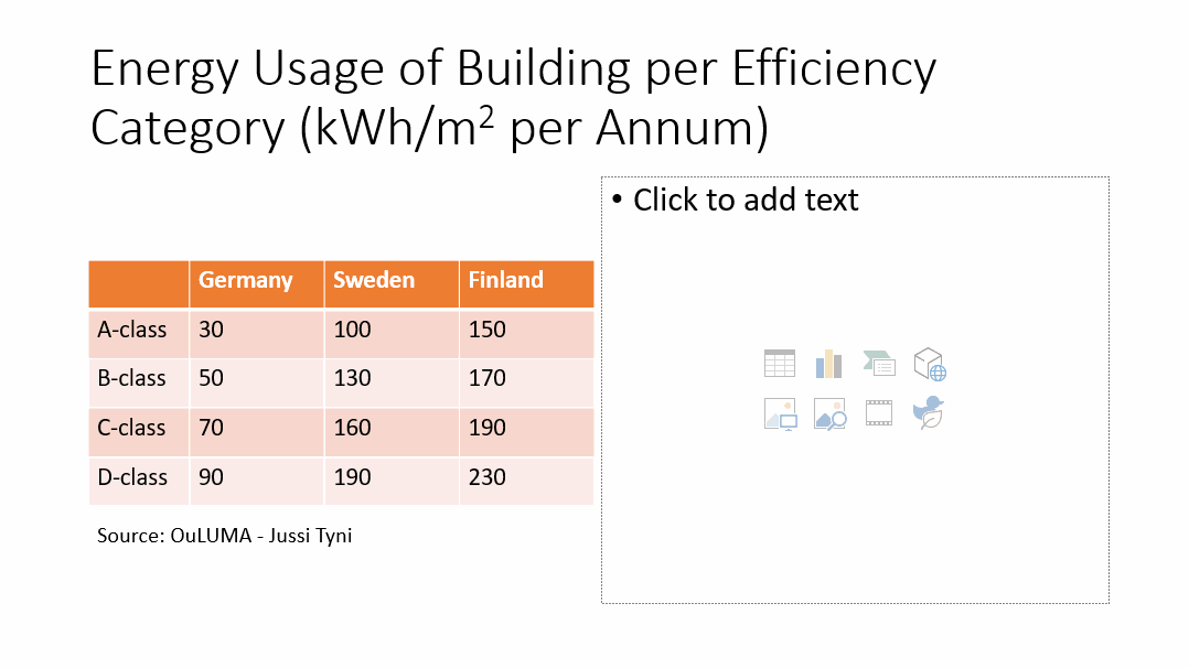
Task: Add a bar chart to the new placeholder
Task: Paste the data in the table to the chart as text
Copy the data from the table on the slide into the table menu that opens and paste it into it as text. Check that all the data is also displayed in the chart.
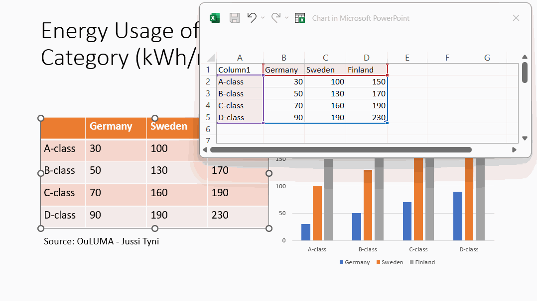
Info: Changing the size of an area in the chart
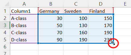 |
You can change the size of an area by grabbing and dragging the lower right corner of it. |
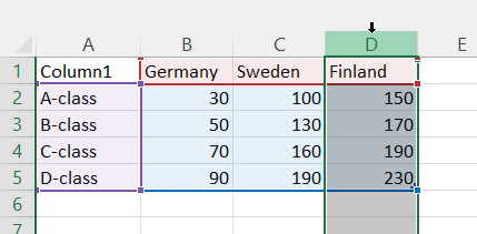
Info: Deleting data from columns and rows
Click on the row number or column letter and press the keyboard shortcut Ctrl+-
Info: Entering and editing data in Excel
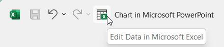 | If you need to add e.g. calculations or other Excel functions to your table, click on the **Edit Data in Microsoft Excel** in title bar. |
The table opens in Excel, where you can continue editing it. The rows and columns added in Excel will automatically expand into parts of the chart.
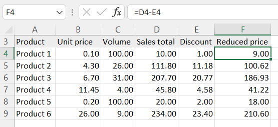
When you're done editing the table, close the table window.
Info: Editing and formatting the chart
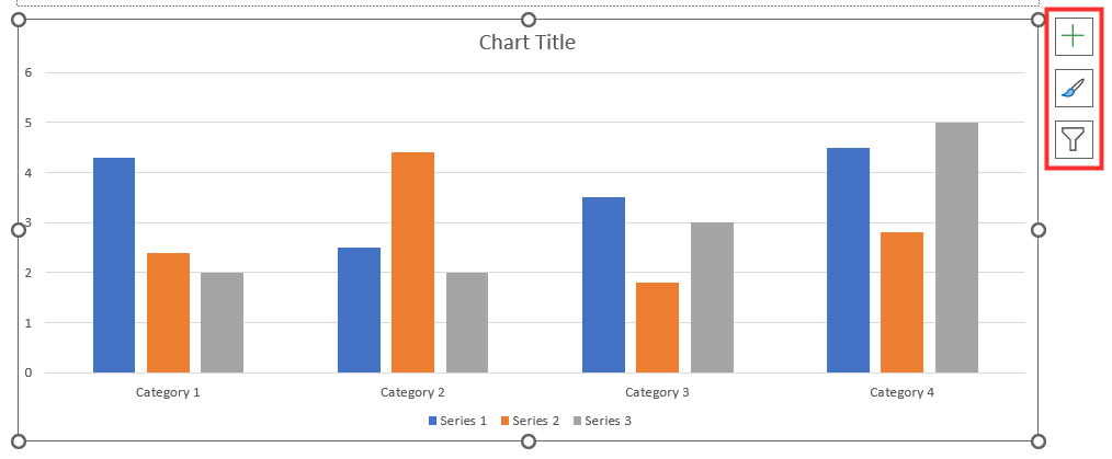
You can edit and format the chart either by chart tabs or the buttons that appear beside the chart when you activate it.
When you activate the chart, you can see two new tabs on the ribbon menu. On the tab Chart Design you can edit and format the whole chart. On the Format tab you can edit a selected part of the chart.

In addition, when the chart is selected, three buttons appear next to it, for quick edits and designs.
Task: Remove the title of the chart
In PowerPoint, the title of the chart is usually removed and instead placed as the title of the whole slide.
Task: Add data labels
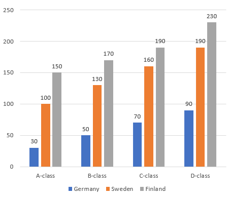
After you've removed the title and added the data labels, the chart should look like this:
Task: Remove the y-axis values on the chart
Task: Remove the grid
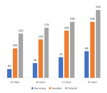
After you removed the y-axis values, the table should look something like this:
Info: Chart styles
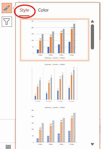
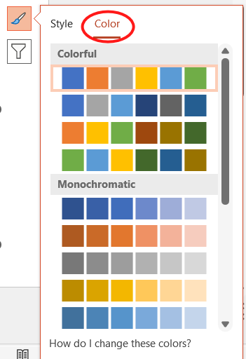
On the Style tab you can add predefined styles to your chart, and on the Color tab you can change its colors.
 |
 |
Info: Chart filters
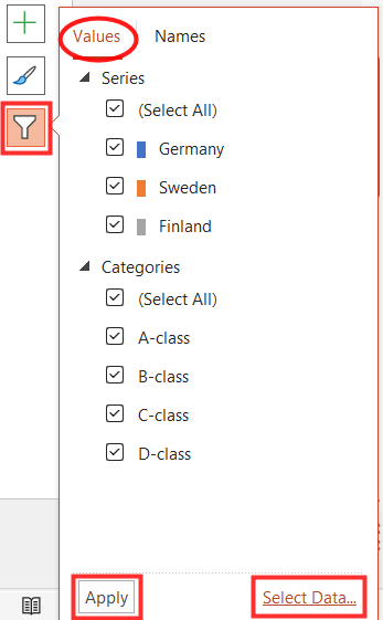 |
You can choose to filter a part of the chart data. Press Apply to activate the filters. By pressing Select Data you can open a window where you can change the locations of source data, modify the order of data, remove some data, or change data rows to columns or vice versa. 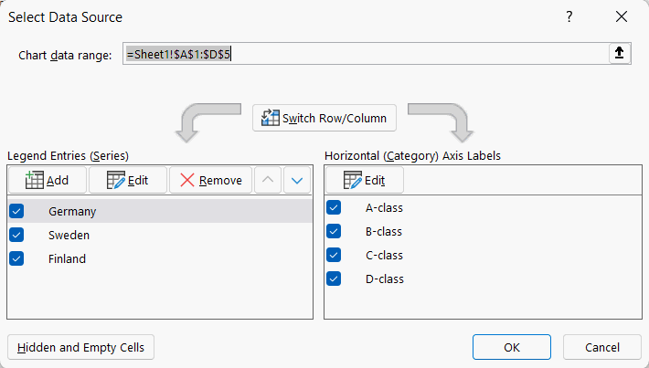 |
Info: Changing a chart template
On the Chart Design tab, in the Type group you find Change Chart Type button. Clicking it you open All Charts window.
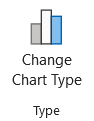 |
There you can find among others the chart template Combo, which lets you easily specify that some chart values be shown as a line, for example. |
Info: Changing chart values
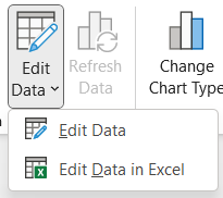 |
If you want to change values used in the chart, navigate to the Chart Design tab, then the Data group, and press Edit Data. When you click over Edit Data, you can choose to edit the data in Excel or right there in the PowerPoint chart. |
You made it to the end of yet another page, good! Now you should also have mastered adding and editing charts in PowerPoint. Take a moment to think about how well you have learned these skills:
Reflect
PowerPoint - Charts - Self evaluation
Please estimate how likely you are to be able to create and edit charts in PowerPoint independently at this time.
- I still don't feel that I am capable of independently creating and editing charts.
- I'm still a little unsure, but with the instructions I might be able to manage.
- I could probably manage to create and edit charts on my own for the most part, but maybe I'd like to have instructions or a tutor just in case.
- I find using charts to be easy and clear, I could certainly manage independently.
Would you help us and the future course participants and tell us briefly how we could improve the course? We are also happy to hear about the areas where we have been successful. The best way to reach us is by e-mail at [email protected].
Check again that you have completed all the exercises and then move on to learn how to import a chart you created in Excel into PowerPoint.
Are you ready?