Charts
Next, let's familiarize ourselves with the diagrams. You can already open the Chart sheet from your Excel practice workbook.
You can use charts to illustrate the information presented. A chart makes it easier to compare and relate data. A suitable chart gives a quick overview of the data but also contains additional information so that you get a good mental image of the data.
 |
In Excel, much like Word and PowerPoint, you can use many different chart types. |
The Objective
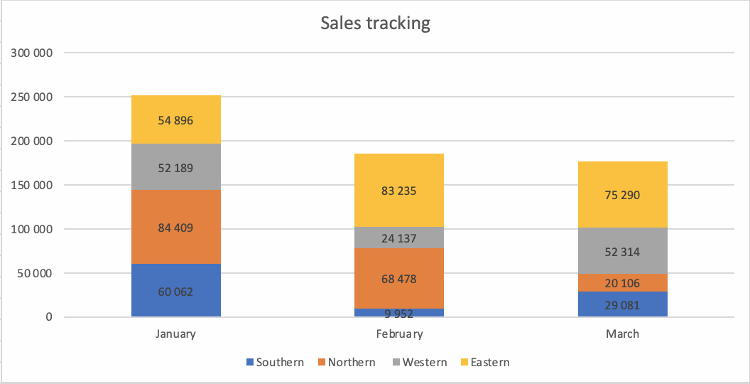
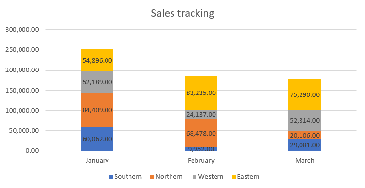
In the exercise, we will create a chart. Its type will end up being Stacked Column, where we have added data labels. Note that the value points have been formatted to use a thousands separator, but not decimals.
Video: Formatting with a thousands separator
Task: Add thousands separators to the value formatting
Navigate to the Chart sheet.
First, format the thousands separator for the values entered on the sheet.
When the values are large, the thousands separator design makes them easier to read.
You will also notice during the task that the formatting you want for the chart should also be added to the sheet.
Task: Fix ###### cells
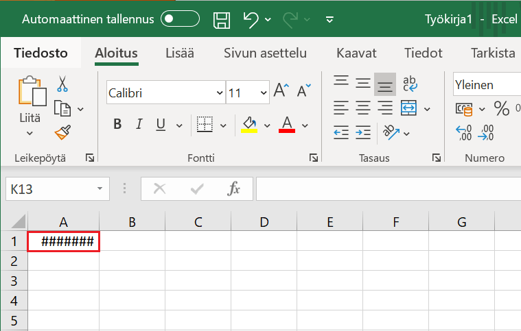
If Excel doesn't have the necessary space to show the cell using the desired formatting, the content will appear as ######. An example is where the value 123456789 has been set to use the thousands separator.
| #### Insufficient space | #### The column width extended |
 |
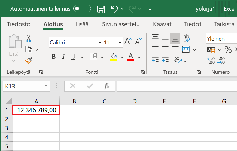 |
Fix the sheet Chart by extending the column width until the ###### becomes a numeric value.
Mac: Recommended charts and clustered column chart
The macOS version of Excel differs slightly from the Windows version regarding recommended charts.
In addition, the charts are named slightly differently.
Task: Insert chart: column chart
A handy way to create a chart is Recommended Charts, which will provide chart types that match the data you select. Next, let's practice using the tool.
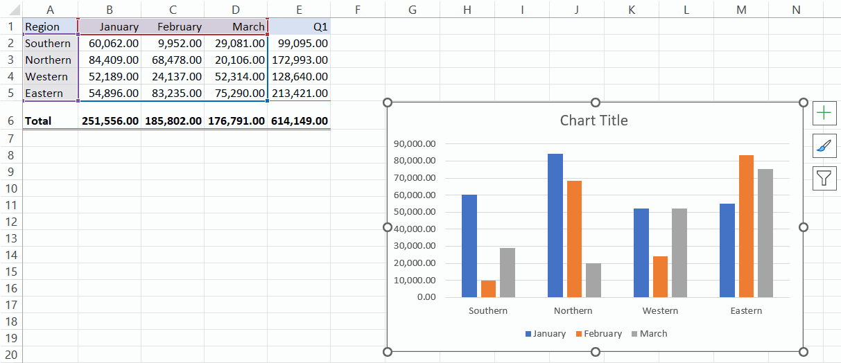
Make a column chart by month and region, based on the data from the Chart spreadsheet.
Model:
Info: All the charts
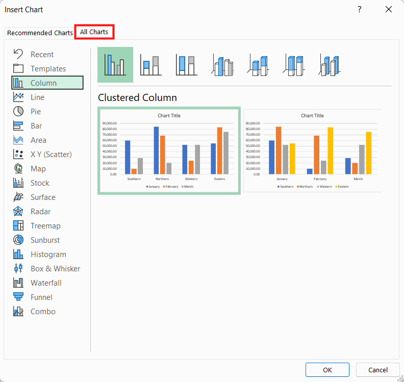
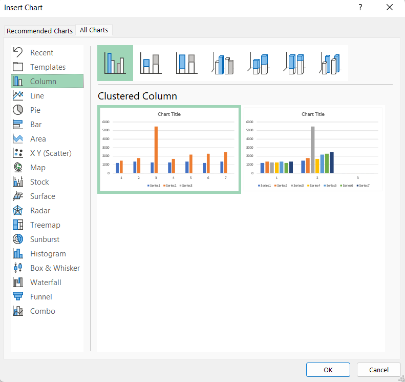
If you can't find what you're looking for in the list of recommendations, you can choose from a wider range of alternatives on the tab All Charts tab.
Task: Move the chart and increase its size
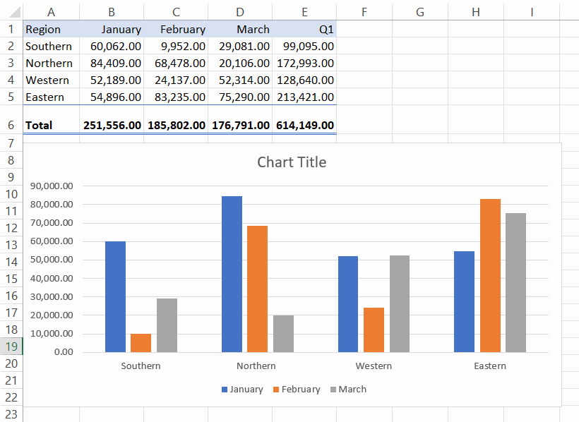
The chart is placed on the same sheet where the data is. Lay out the diagram neatly. Model:
Task: Give the chart a title
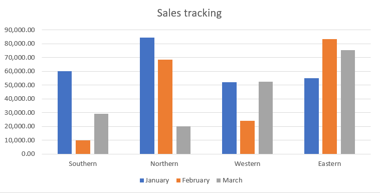
Give the chart the title “Sales tracking”. Model:
Mac: Changing chart type and stacked column chart
On the Mac version, finding a stacked column chart is a bit more difficult because the All Charts window is missing.
Task: Change the chart type
Continue with the task in the Chart table.
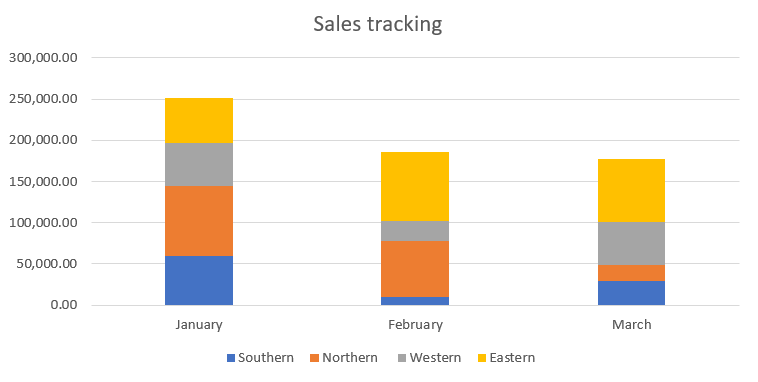
Change the column chart you made to the chart type Stacked Column so that the columns are for months and they are split into parts for regions.
Model:
Mac: Adding data labels
In the Mac version, there are no buttons associated with the chart, so the data labels are added from the selection ribbon.
Video: Adding Data Labels
Task: Define data labels in the chart
The next step is to add data labels to the chart.
Model:
Task: Format the data labels
Format the data labels by removing decimals, so that the numbers look neater on the chart.
Model:
Info: Chart filters
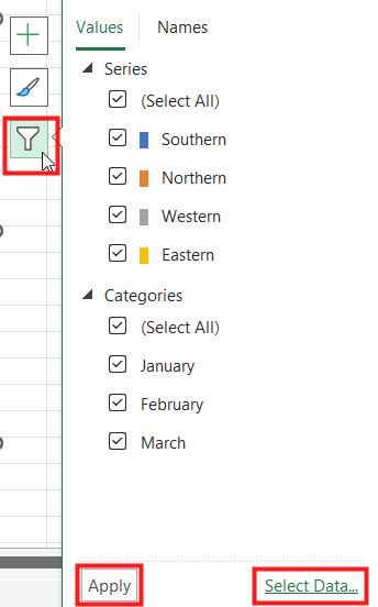 |
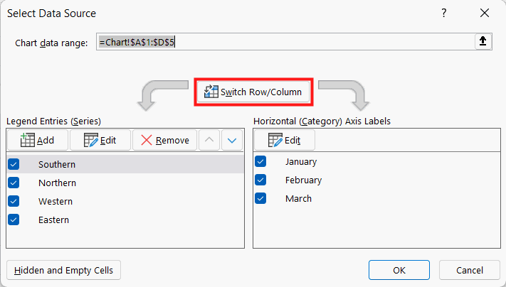
You can filter out some of the data from the chart. Click on the Apply button to enable filtering. The Select Data button opens a window where you can change the position of the source data, change the order of the data, delete some data or change the row/column direction of the data in the chart. |
Extra task: Change chart colors
Continue with the task in the Chart sheet.